
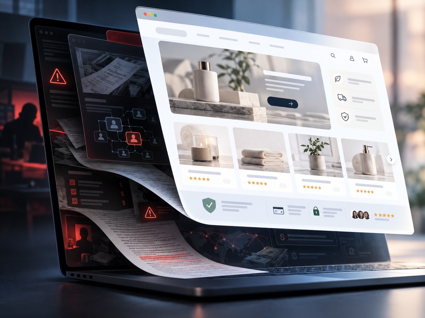
The short version
- Polished design can increase perceived credibility and initial trust, especially when the visitor does not already know the business.
- People form visual impressions extremely quickly, so design can shape the starting point before slower verification begins.
- The strongest evidence is about perceived trust, not actual safety: a good interface cannot prove who owns the business, whether claims are true or whether customers will be made whole.
- Research on phishing shows why that distinction matters: convincing page content can pull attention away from stronger legitimacy signals such as the real domain and independent verification.
- Treat polish as evidence that someone invested in presentation. Verify the business with facts that are harder for the website itself to manufacture.
Yes. But “looks safe” and “is safe” are different claims.
A polished website can make an unfamiliar business feel more credible before the visitor knows much about the company behind it.
That is not just a design cliché. Experiments have repeatedly found that changing visual presentation can change credibility or trust judgments even when the underlying content stays the same. In one study, David Robins and Jason Holmes presented the same material with different levels of aesthetic treatment and found that the more polished version was judged as more credible. A later experiment focused specifically on unfamiliar online vendors found that visual appeal was an important driver of trust.
The important boundary is what those studies actually establish.
They show that presentation can move perceived credibility. They do not show that attractive businesses are safer, that ugly businesses are dangerous or that design overwhelms every other signal.
A clean checkout, careful typography and tasteful photography can tell you that someone invested in the website. They cannot tell you whether the seller will ship the product, whether a financial claim is true, whether a regulator recognizes the company or whether there will still be someone answering email after the payment clears.
A polished website can lower suspicion without adding a single fact about the business behind it.
That is why the effect matters most when the business itself is unfamiliar.
The first judgment happens before due diligence
People do not begin every visit by opening a corporate registry, checking the domain history and reading the refund terms.
They look at the page.
Gitte Lindgaard and colleagues found that participants could form stable judgments of a homepage’s visual appeal after exposures as short as 50 milliseconds. That experiment measured visual appeal, not business legitimacy, so it should not be converted into the claim that people decide whether a company is trustworthy in 50 milliseconds.
But it shows how early the visual system gets a vote.
By the time a visitor reads the offer, the page has already communicated something: amateur or established, chaotic or controlled, temporary or permanent, cheap or expensive, familiar or strange.
A 2020 HCI experiment likewise found that website design had a powerful effect on users’ trust perceptions, with professional visual design helping create a positive first impression.
That first impression becomes the starting condition for everything that follows.
If the site feels competent, later claims arrive inside a more favorable frame. If it feels broken, visitors may reject the business before they evaluate the offer at all.
Good design can function like borrowed reputation
Established businesses bring outside context with them. You may already know the name, have used the product, seen a physical location or know someone who has dealt with the company.
An unknown business has none of that.
Its website has to carry more of the identity.
That is exactly where design becomes powerful. In a review of experiment-based research on initial B2C trust, Farhod Karimov, Malaika Brengman and Leo Van Hove concluded that website design cues can increase initial trust toward unfamiliar vendors. Their review also cautioned that the evidence was not equally strong for every individual visual cue.
The useful takeaway is not “make it pretty and people will believe anything.”
It is that an interface can supply some of the confidence that, offline, might have come from a storefront, a recognizable location, a salesperson, a known brand or years of reputation.
For a legitimate new business, that is useful. A customer needs some reason not to assume the unknown seller is incompetent.
For a questionable business, the same mechanism is available.
The CSS does not know who is honest.
Questionable businesses do not need design to prove safety
They only need it to remove enough friction for the visitor to continue.
That is a lower bar.
A fake or unreliable operation may not need you to conclude, “I have verified this company.” It may only need you to stop thinking, “This looks sketchy.”
The distinction appears in research on how people evaluate health websites. In a small but influential study, Elizabeth Sillence and colleagues observed people searching for health information and found support for a staged process: design appeal was strongly involved in rejection, while content credibility and personalization mattered more when people selected sites to trust.
In other words, design can be a gate.
A site that fails the visual test may never get considered. A site that passes it earns more time for its claims, testimonials, guarantees and sales copy to work.
That pattern is especially relevant to questionable businesses because the page itself is one of the few things the operator fully controls.
The company may not control independent reviews, complaint histories, regulator records, chargebacks or what former customers say. It controls the hero section.
Phishing shows the extreme version of the problem
A questionable business and a phishing site are not the same thing. One may be a real company with poor practices; the other may be impersonating an entirely different organization to steal information.
But phishing research demonstrates the danger of relying too heavily on what a page looks like.
In a 2015 eye-tracking study, participants were asked to identify phishing websites. They successfully detected only 53% of the phishing sites, even though the task explicitly primed them to look for fraud. They spent relatively little time examining browser security indicators compared with the website content itself.
The attacker benefits from a simple mismatch in attention: the page can look familiar while the domain tells a different story.
Google’s phishing guidance makes the same practical point from the defensive side: a phishing page can look exactly like a real site, which is why the address bar matters.
This does not mean people are helpless. It means visual similarity and professional execution are available to both legitimate and deceptive actors.
The padlock is another borrowed signal
For years, the padlock and https:// became shorthand for “secure website.” Technically, they answer a narrower question: is the connection encrypted?
That matters. It is not a legitimacy certificate.
The U.S. Federal Trade Commission explicitly warns shoppers that HTTPS does not mean a site is legitimate. Scammers can encrypt their sites too.
The same mistake can happen with other surface signals:
| What the site shows | What it may legitimately indicate | What it does not prove |
|---|---|---|
| Polished visual design | Investment in presentation | Honest ownership or business practices |
| HTTPS / padlock | Encrypted browser connection | Legitimate seller |
| Customer reviews on the site | The site displays testimonials or ratings | Independent customer experience |
| “Secure checkout” language | The operator wants the purchase to feel protected | Refundability or buyer recourse |
| Brand logos / partner logos | A logo file appears on the page | A current commercial relationship |
| Professional product photography | Someone produced or acquired strong imagery | Inventory, fulfillment or product authenticity |
| Detailed policies | Terms exist on the site | The operator will follow them |
A sophisticated website can therefore contain many real interface signals that are easy to mistake for external verification.
The same problem appears with screenshots. A screen can faithfully show what an interface displayed without proving the larger claim built around it. Our guide to screenshots and context makes the same distinction: presentation is evidence of presentation first.
The effect is not unlimited
If visual polish were enough, every beautifully designed fraud would succeed and every ugly legitimate website would fail.
That is obviously not how people behave.
The literature is more interesting than that.
The 2011 review of initial online trust found broad support for web design cues, but it also found that the strength of evidence varied across specific features. The health-site study found that design helped determine what people rejected, while the credibility of the information itself became more important later. And a polished interface cannot rescue an offer that collides too hard with outside evidence.
There is also a difference between trust, credibility, visual appeal, perceived usability and purchase intention. Studies sometimes measure one and discuss its relationship with another. They should not be flattened into a single “professional design makes people trust scams” statistic.
There is no clean percentage in the research that says a questionable business becomes, say, 30% more believable after a redesign.
The defensible conclusion is narrower:
Good design can improve the initial credibility environment in which a business is judged.
That advantage is useful to honest businesses and exploitable by dishonest ones.
The website is strongest when the visitor has no outside reference
Imagine two businesses selling the same high-priced service.
You have used one for three years. The other appeared in an Instagram ad five minutes ago.
The known business carries a history into the page. The unknown one starts closer to zero.
For the unknown seller, small cues do more work. A coherent identity, fast loading page, clear navigation, precise copy, real-looking staff photographs and a convincing checkout can collectively create the feeling of an organization that has its act together.
That feeling is not irrational. Legitimate businesses often do invest in good design, usability and clear information.
The problem is that the cue is copyable.
This is structurally similar to why fake wealth works online: the visible signal can become cheaper to reproduce than the underlying condition it traditionally implied.
A polished corporate presence once required designers, developers, photographers and significant time. It still can. But templates, site builders, outsourced design systems and generative tools have reduced the cost of creating a professional-looking surface.
The cost of the signal has fallen faster than the cost of becoming a trustworthy company.
What should replace the visual judgment?
Not suspicion of every attractive website.
Verification should move from facts the seller controls to facts that are harder for the seller to manufacture alone.
For an unfamiliar business, useful checks include:
- search the company name and domain outside its own website;
- look for recent complaints and independent reviews across multiple sources;
- verify the legal company name, address or regulatory status when the transaction warrants it;
- check whether the domain in the address bar is actually the company you intended to visit;
- read refund, shipping and cancellation terms before paying;
- be cautious when the only accepted payment methods make recovery difficult;
- use payment methods with meaningful dispute protection for ordinary purchases.
The FTC recommends several of these steps for online marketplaces, including checking the site and seller independently and using safer payment methods.
This is slower than looking at the homepage.
That is the point.
Visual judgment is fast because it compresses information. Verification is slower because it tries to recover the information the surface cannot provide.
The research question SIGNULL should test directly
Existing research gives a strong basis for saying that aesthetics and professional design can move initial credibility and trust judgments. It gives less direct evidence for the exact version of the question in this headline: how much safer does a genuinely questionable business appear when only the website polish changes?
That would make a clean first-party experiment.
Participants could see matched fictional businesses with identical offers, claims, policies and prices. The only manipulated variable would be visual execution: intentionally rough versus professionally polished. A second manipulation could introduce the same objective warning sign — for example, a restrictive refund policy or an unusually risky payment method — into both versions.
The study could then measure separately:
- perceived legitimacy;
- perceived safety;
- willingness to purchase;
- recall of the warning sign;
- likelihood of checking an outside source.
The key question would not be whether people “fall for” a fake business. It would be whether polish changes how much weight they give to the same underlying evidence.
No such SIGNULL experiment has been run yet. The evidence in this article comes from the existing literature and consumer-protection guidance.
Polish is a credibility cue, not a background check
The web trained people to use design as a shortcut because design often contains useful information. Broken pages, incoherent branding and careless errors can signal neglect. A well-made site can signal competence.
But competence at making websites is not the same as competence at running the business being advertised on one.
Stanford’s Web Credibility Project has long advised organizations to make sites look professional because visual design affects perceived credibility. The advice works precisely because visitors use the cue.
That makes visual polish valuable — and dangerous when it is asked to carry more meaning than it deserves.
A beautiful site may belong to an excellent company.
It may belong to a mediocre company with a good designer.
It may belong to a scammer who understands conversion design.
The pixels cannot tell you which one.
Sources & reference material
- Aesthetics and credibility in web site designInformation Processing & Management · Accessed Oct 10, 2026
Experiment showing that the same content received higher credibility judgments when presented with a higher level of aesthetic treatment.
- An experimental investigation of the influence of website emotional design features on trust in unfamiliar online vendorsComputers in Human Behavior · Accessed Oct 10, 2026
Experiment with an unfamiliar hypothetical vendor finding that visual appeal and ease of use contributed to trust, with visual appeal exerting a particularly strong effect.
- The Effect of Website Design Dimensions on Initial Trust: A Synthesis of the Empirical LiteratureJournal of Electronic Commerce Research · Accessed Oct 10, 2026
Review of experiment-based B2C e-commerce research finding empirical support that website design cues can increase initial trust in unfamiliar vendors while noting uneven evidence for individual visual cues.
- Attention web designers: You have 50 milliseconds to make a good first impression!Behaviour & Information Technology · Accessed Oct 10, 2026
Three studies showing that participants formed stable judgments of website visual appeal after exposures as short as 50 milliseconds.
- Trust and mistrust of online health sitesProceedings of the SIGCHI Conference on Human Factors in Computing Systems · Accessed Oct 10, 2026
Observed-search study supporting a staged model in which design appeal predicted rejection while information credibility and personalization were more important to later trust and selection.
- The Impact of Website Design on Users’ TrustProceedings of the 11th Nordic Conference on Human-Computer Interaction · Accessed Oct 10, 2026
Online experiment finding a substantial relationship between website design and trust perceptions, with professional visual design contributing to positive first impressions.
- Why phishing still works: User strategies for combating phishing attacksInternational Journal of Human-Computer Studies · Accessed Oct 10, 2026
Eye-tracking study in which participants detected only 53% of phishing websites and spent relatively little time looking at browser security indicators compared with page content.
- Buying From an Online MarketplaceU.S. Federal Trade Commission · Accessed Oct 10, 2026
Consumer guidance recommending independent checks on unfamiliar sites and sellers and warning that HTTPS encryption does not establish that a site is legitimate.
- Social Engineering (Phishing and Deceptive Sites)Google Search Central · Accessed Oct 10, 2026
Security guidance noting that phishing pages can closely imitate legitimate sites and advising users to inspect the real URL rather than relying on page appearance.
- The Web Credibility Project: GuidelinesStanford University Web Credibility Project · Accessed Oct 10, 2026
Research-based credibility guidance noting that users quickly evaluate sites through visual design and that professional, purpose-appropriate design can increase perceived credibility.